

It made me realized about all the color themes for Nervhous releases/projects. I admit my favorite colors are Red,
Yellow:
Bollok Wok Vol. 3: I tried using either orange or yellow, and finalized with yellow.
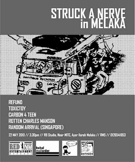
Struck A Nerve Tour campaign: I just wanted to add color, I think I accidentally again, chosen yellow for the campaign.
Senandung Pawer-Kord: We worked as a team to design this one. I think I suggested yellow (again!), and the others agreed.
Always Last ‘Antidotes’: Also yellowish color for the cover, but I wasn’t involve at all in the design part.
Toxictoy ‘Amazingly Realistic Puke!’: Again, it’s yellow colored, but I’m not involved at all in the design part, it was Eman.
Skunkfix ‘The First Two Demos’: It’s bright yellow again. If I’m not mistaken, Emy (the frontman) did the front cover design. I only did the band font design for that release.
Red:
The Twosome Takeover: Red, Black, White. I like these colors combination when I was in high school. Black and Red was always a good color combination in my eyes, since I got Metallica’s black album.
Time Is Monkey: Red. No, I’m not involved in the designing at all.
Punkrock Paradox: The color was red-ish brown. But it was designed by Rizie.
Dum Dum Tak ‘Hentikan Penindasan’: The CD color was red, yeah purely for my love of red!
Last Strive ‘Kuasa Kita’: Not my work at all.
Nervhous blog header: I love orange!
Nizang